
Font Variations


Scroll down for more info.
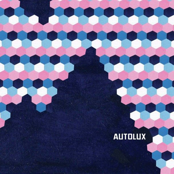
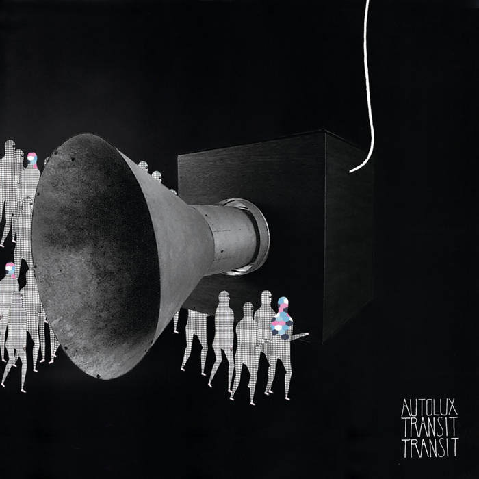
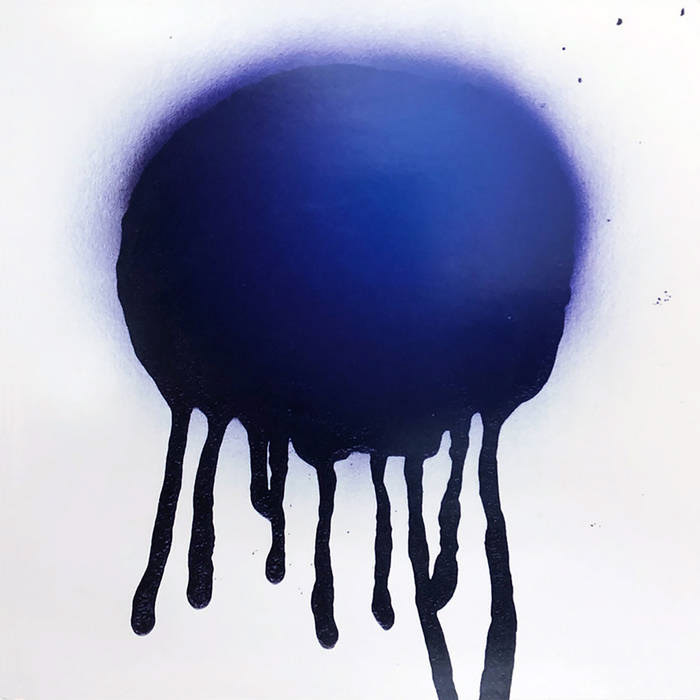
This artwork was inspired by the band Autolux from their music to the artwork attached to their music. Autolux generally has a very abstract aesthetic when they release artwork in conjunction to their music. Here are some examples of album covers and single covers released by Autolux which are all varying in style but all have an abstract style to them. You can find examples of this through not only their album covers but also their posters, merchandise, and music videos.

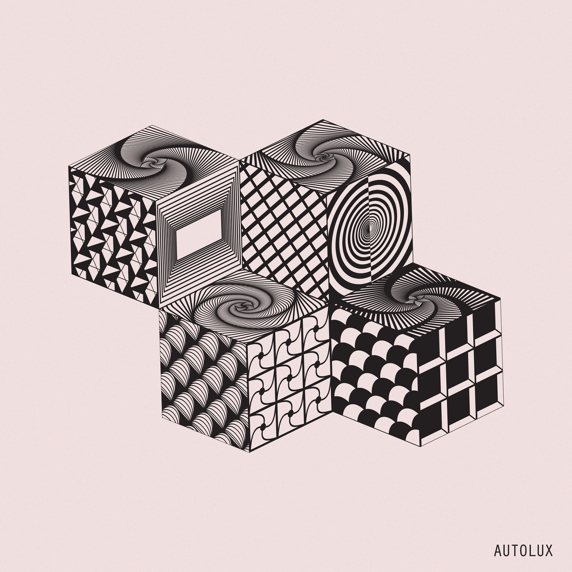
My thought process when making was to just making something aesthetically pleasing that could associate with Autolux but also stand on its own. I was messing around with geometric shapes until I settled on a cube at this particular angle, and after trial and error I finally decided that 4 cubes in a square frame to fit into something like Instagram was my goal. Before I got to this point though I was actually attempting to make text cubes spelling Autolux and possibly moving onto song or album names, which I consider part of the drafting of this project shown in the examples below.


The final designs on each cube side was a mixture of random patterns I created and also experimenting with spirals. Since these patterns were all made as a vector design, I can zoom in and almost unravel some of the more intricate patterns like the spirals, which I'm considering animating possibly as a music visualizer. I chose this muted pinkish pastel background because I think it makes a strong statement and I thought anymore color would diminish from the idea I was picturing, however I think several other colors could work well, which is generally how I prefer to make my designs, whereas my designs could fit with several color schemes