Instagram mockup on phone.
Scroll down for more details.
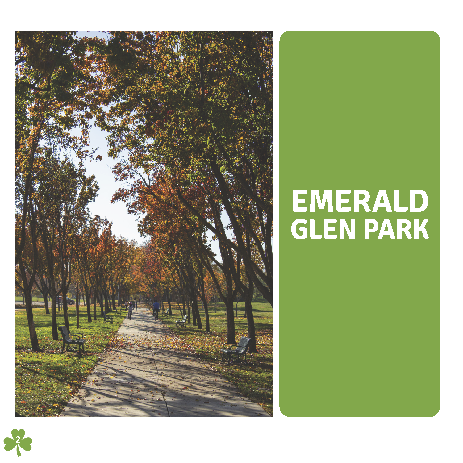
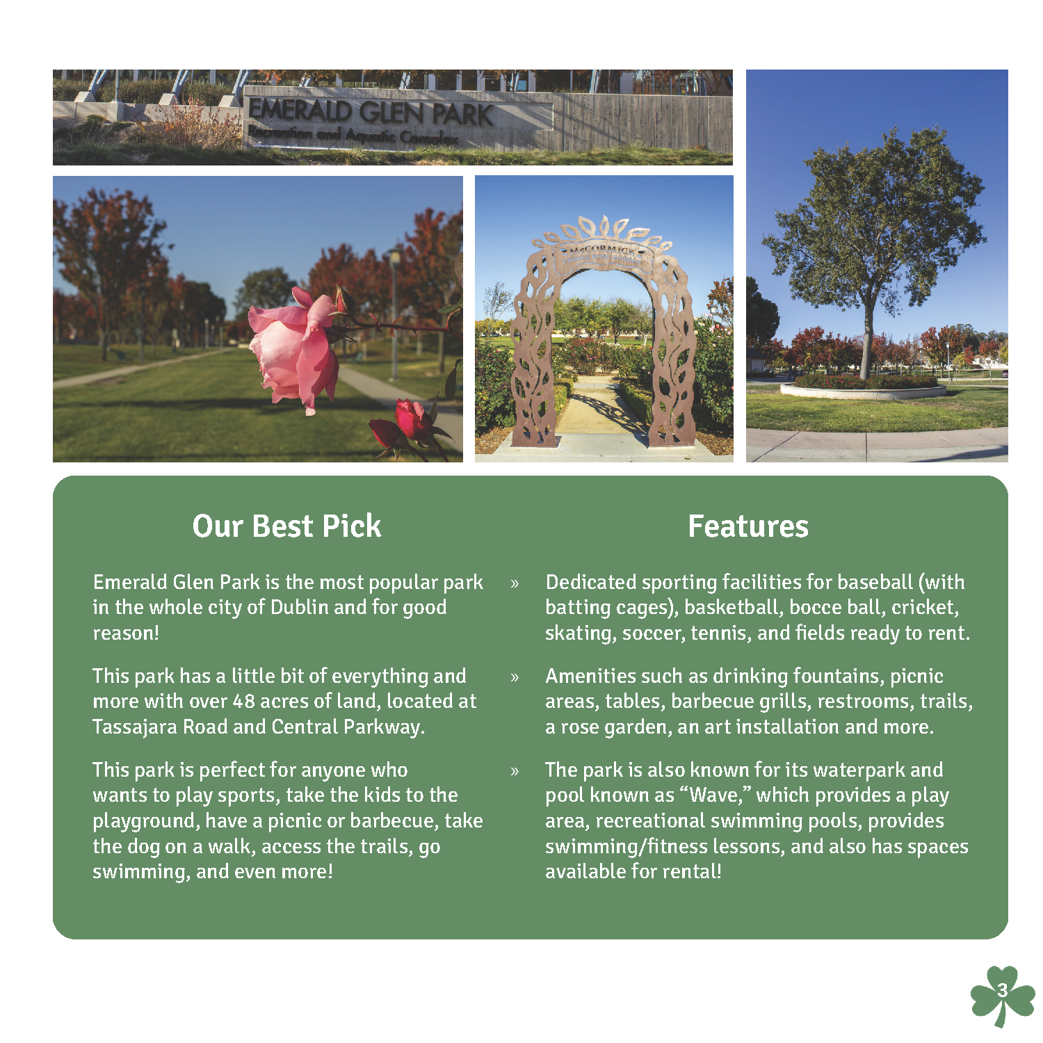
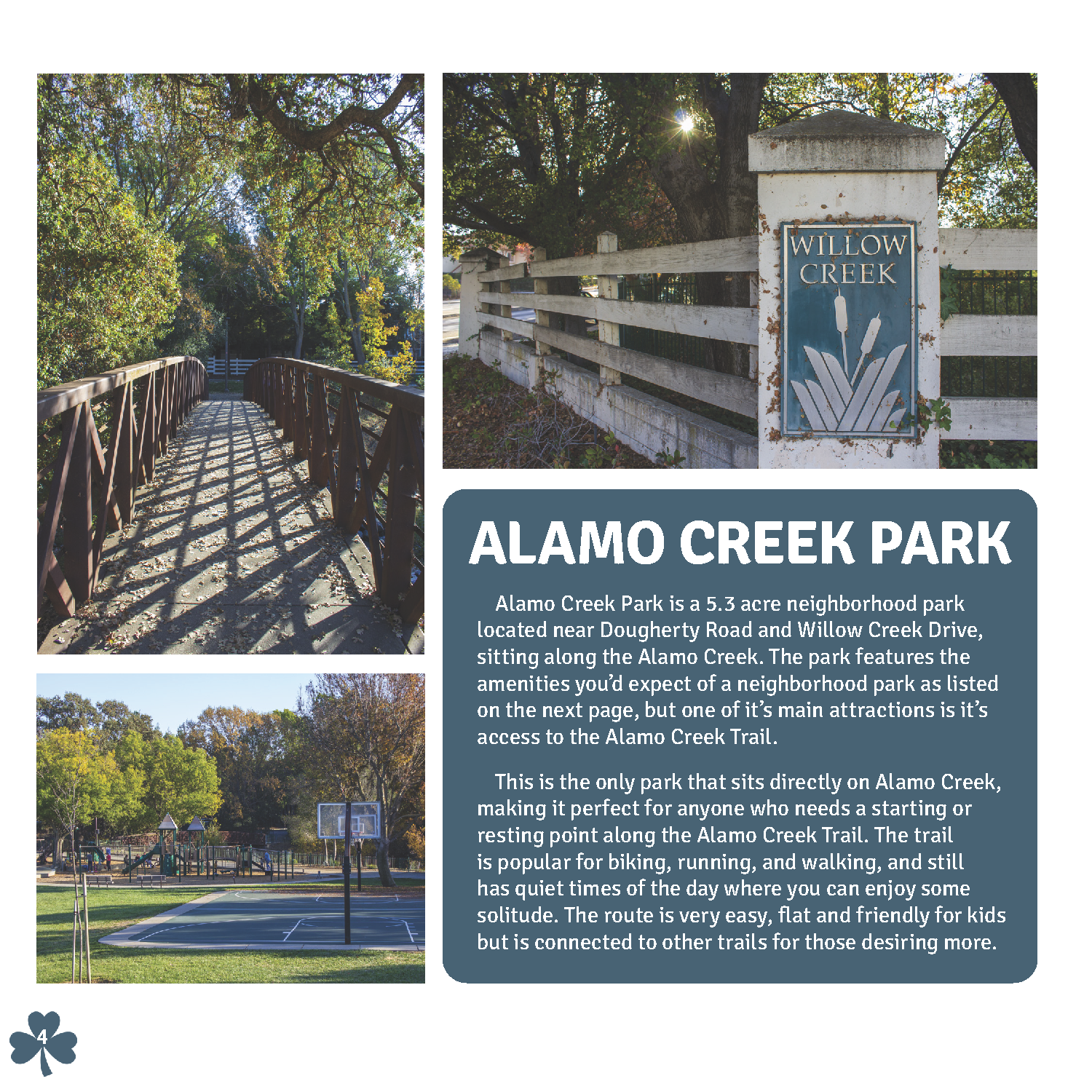
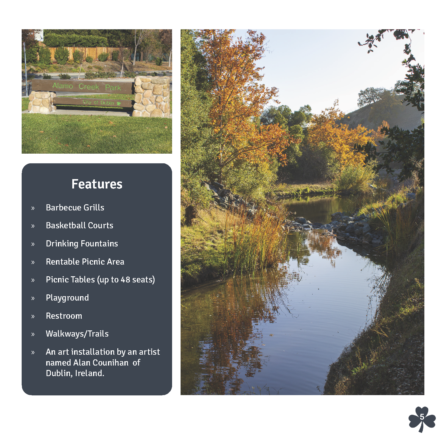
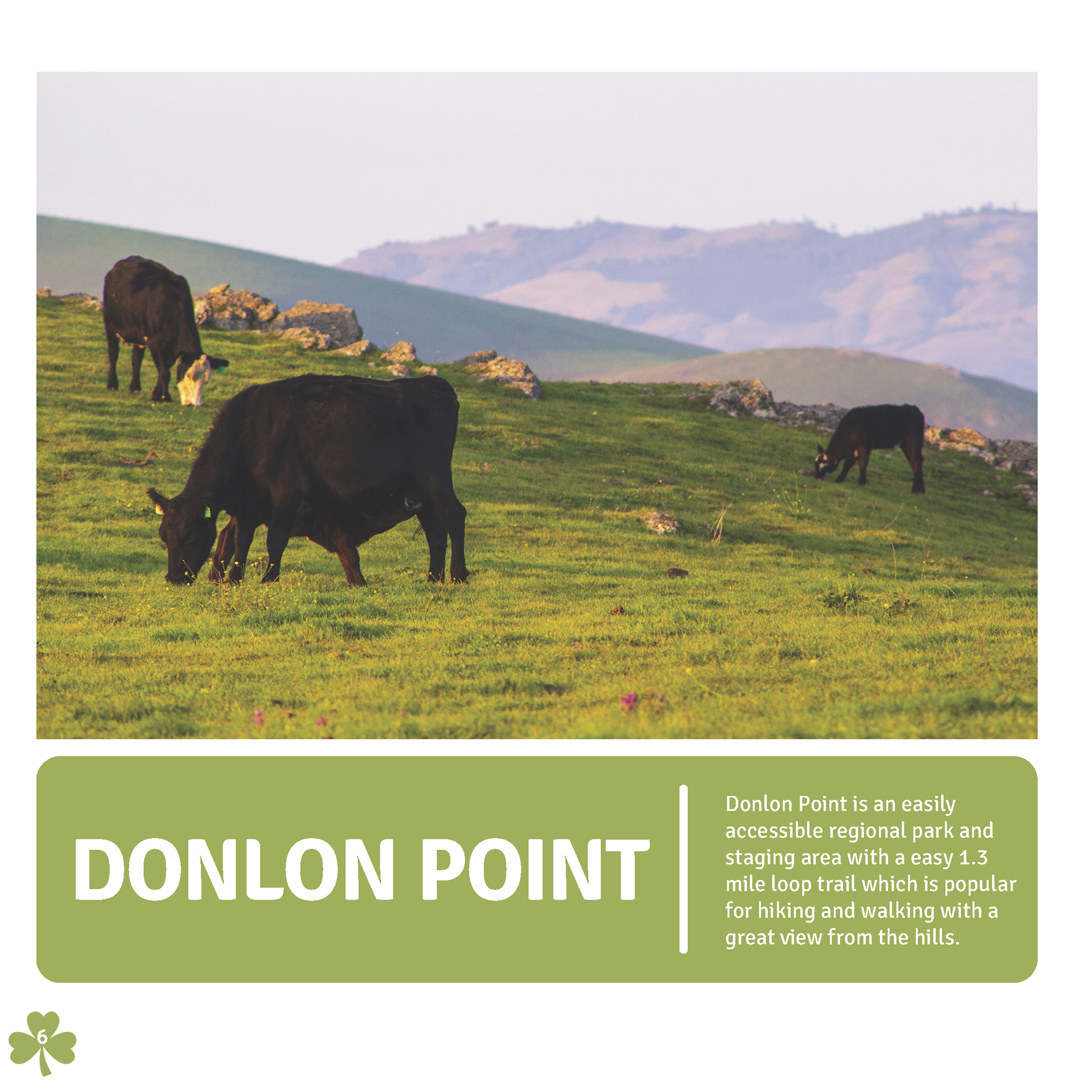
This is a concept design for a brochure or travel guide to city nearby to me called Dublin, California. I used this concept work to better understand how to make a booklet, add a brand to it, and also do the photography to fit the narrative.
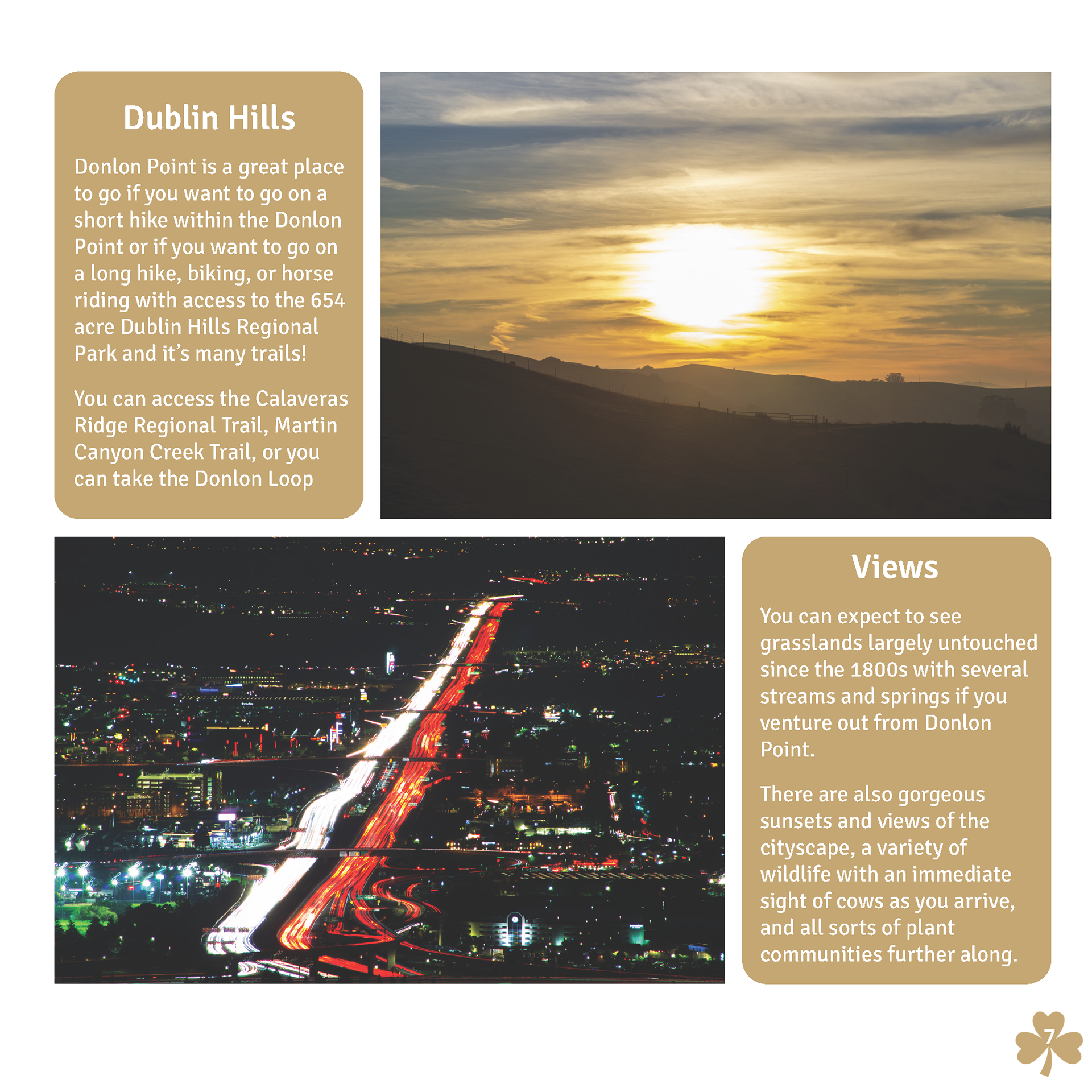
To create this booklet I started by looking up important places around the city and luckily I already knew some interesting places around Dublin so I went out a few times with my camera and took photos throughout the day and even some long exposure shots during the nighttime over the freeway.
For my color scheme I went with earthly colors that fit well with the subject of the locations which all revolved around the outdoors at parks or by water. On each spread I used similar colors that I felt not only fit the specific locations well but also linked together some of the locations based on the makeup of the area. For example, the spread of Alamo Creek Park uses blue colors but I decided to use two different blues to make it feel connected but also refreshing not as repetitive. I also used Dublin's iconic clover as the symbol for the page numbers.
Some of the early designs had boxes without curved edges, one color scheme, and didn't include as much attention to detail. Here are some of the drafts and early work for this project and it's assets:
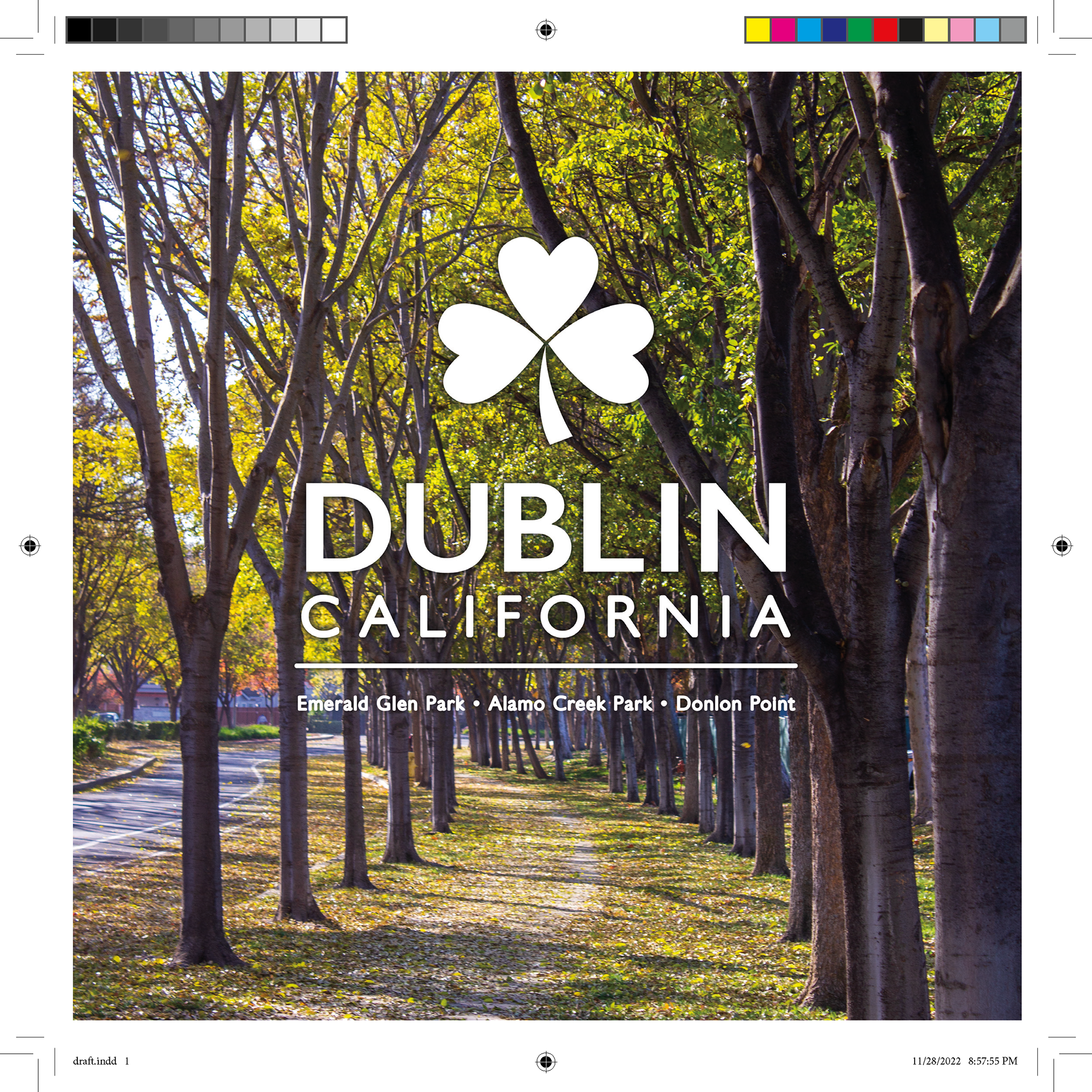
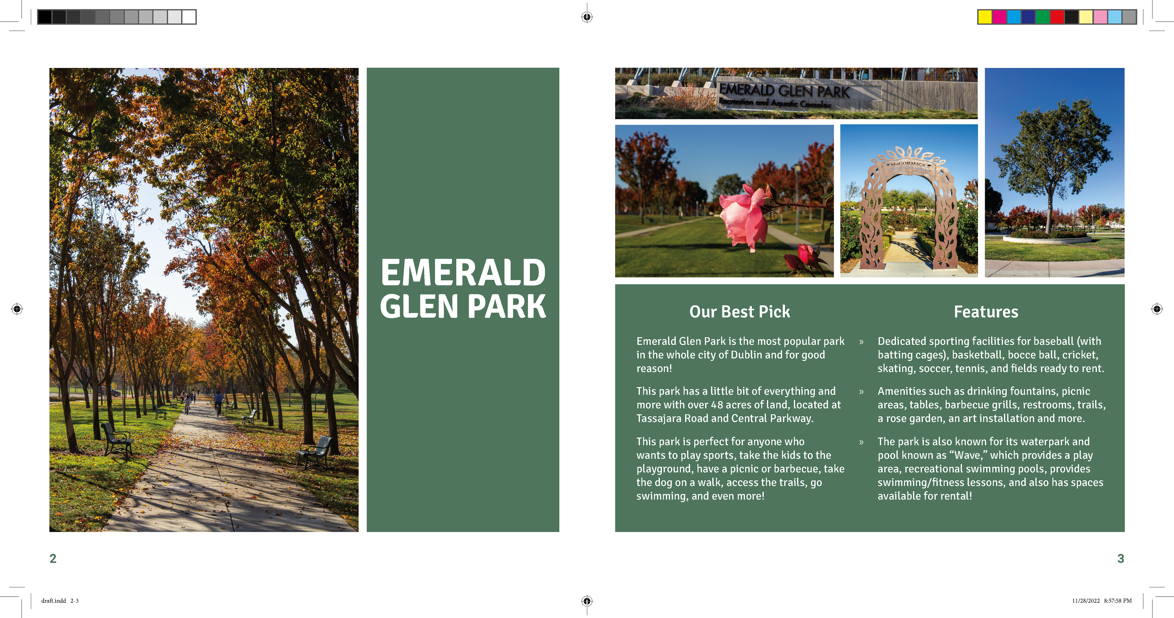
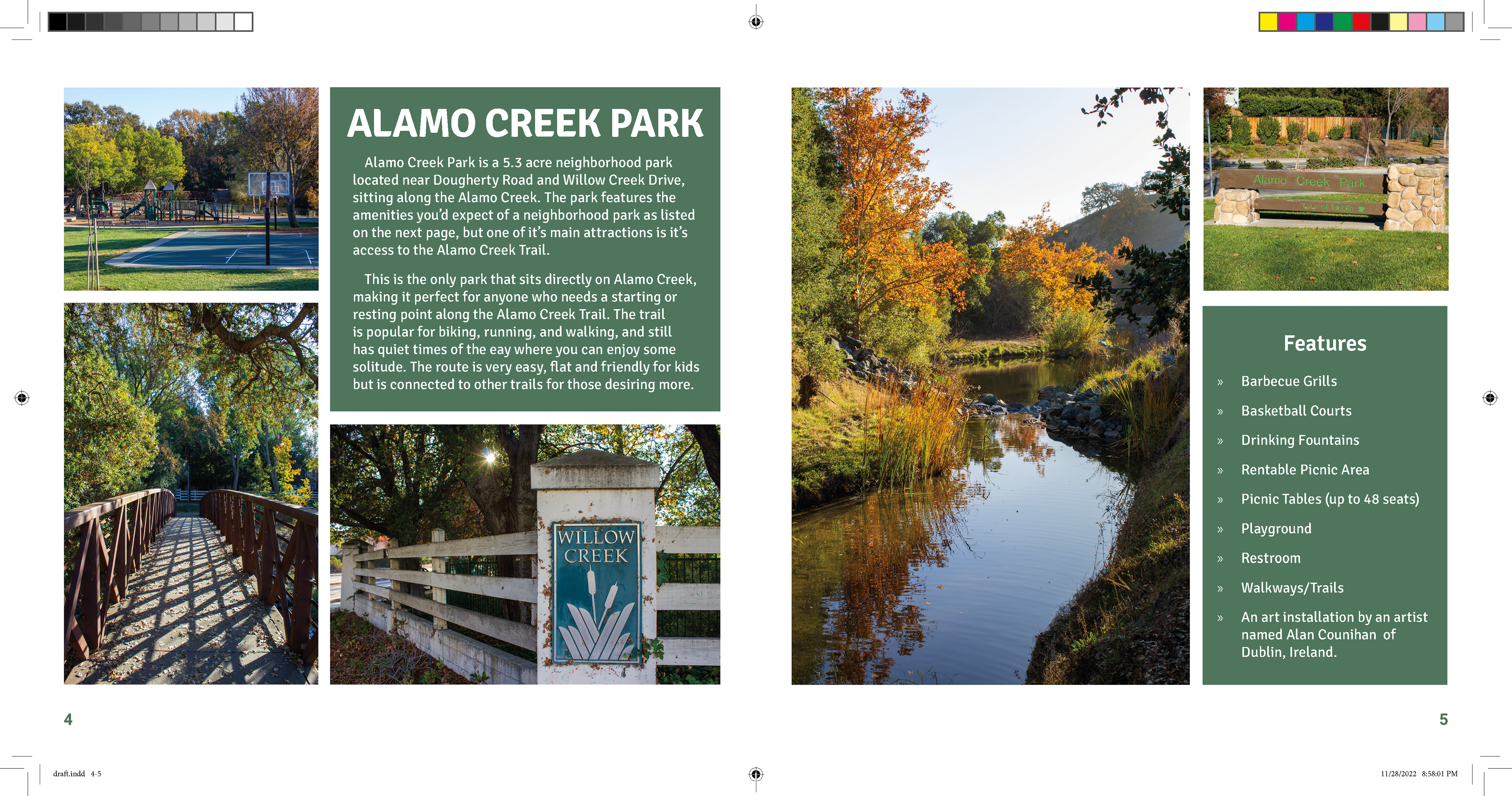
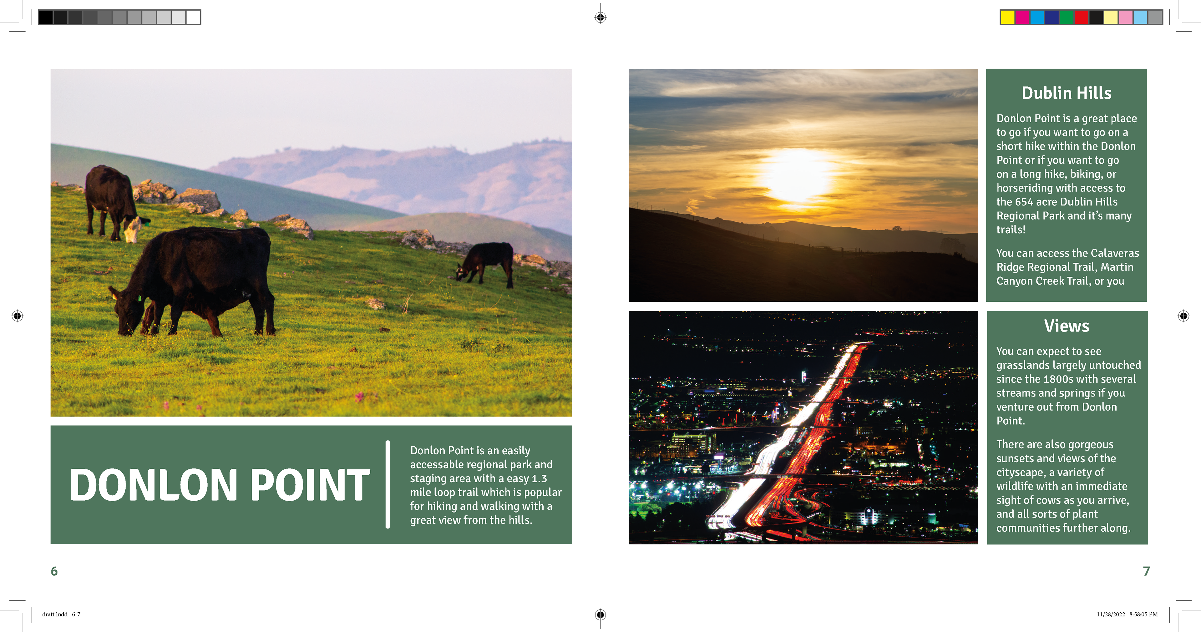
Here is the rough draft of the booklet.
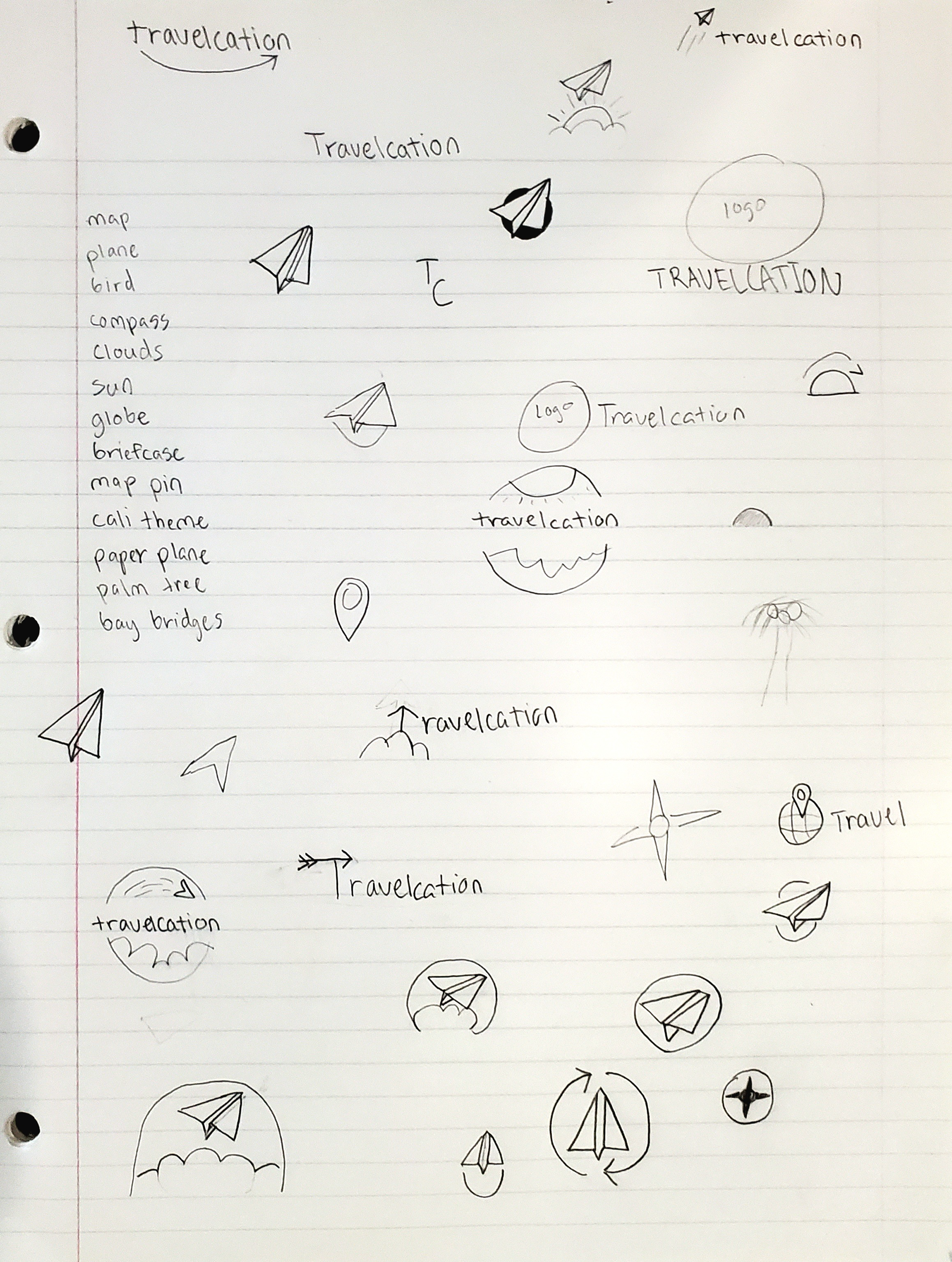
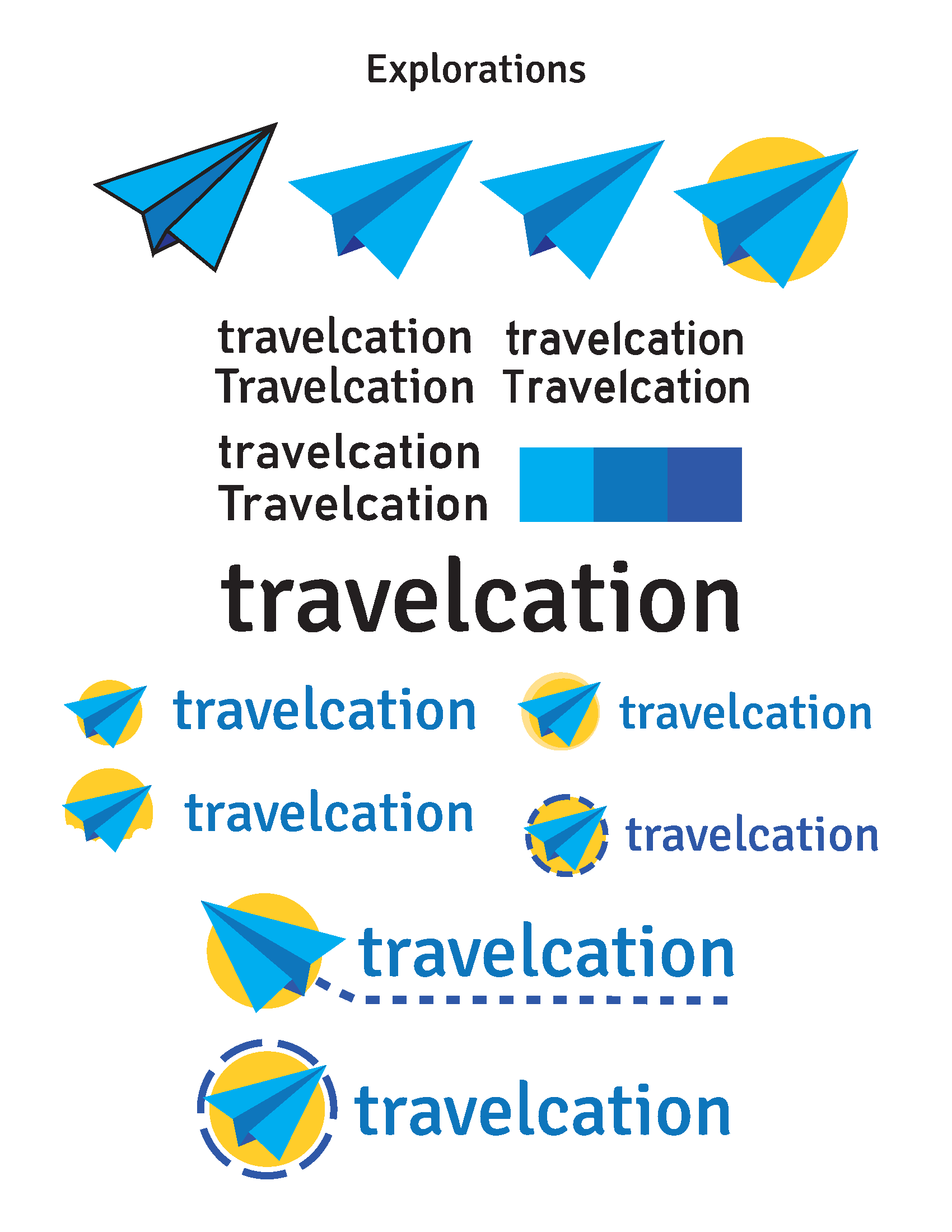
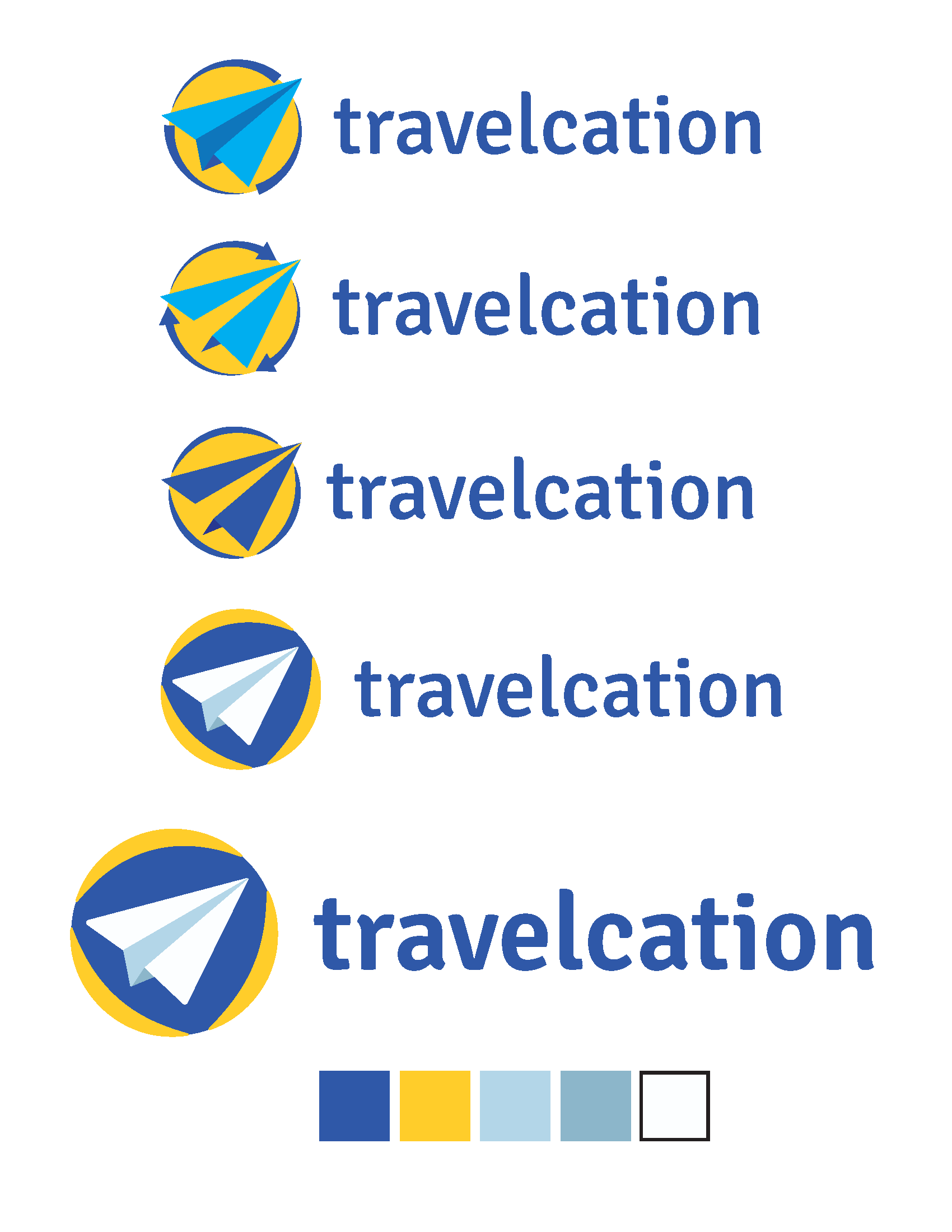
Here is some of the experimentation and sketches for the travelcation logotype.
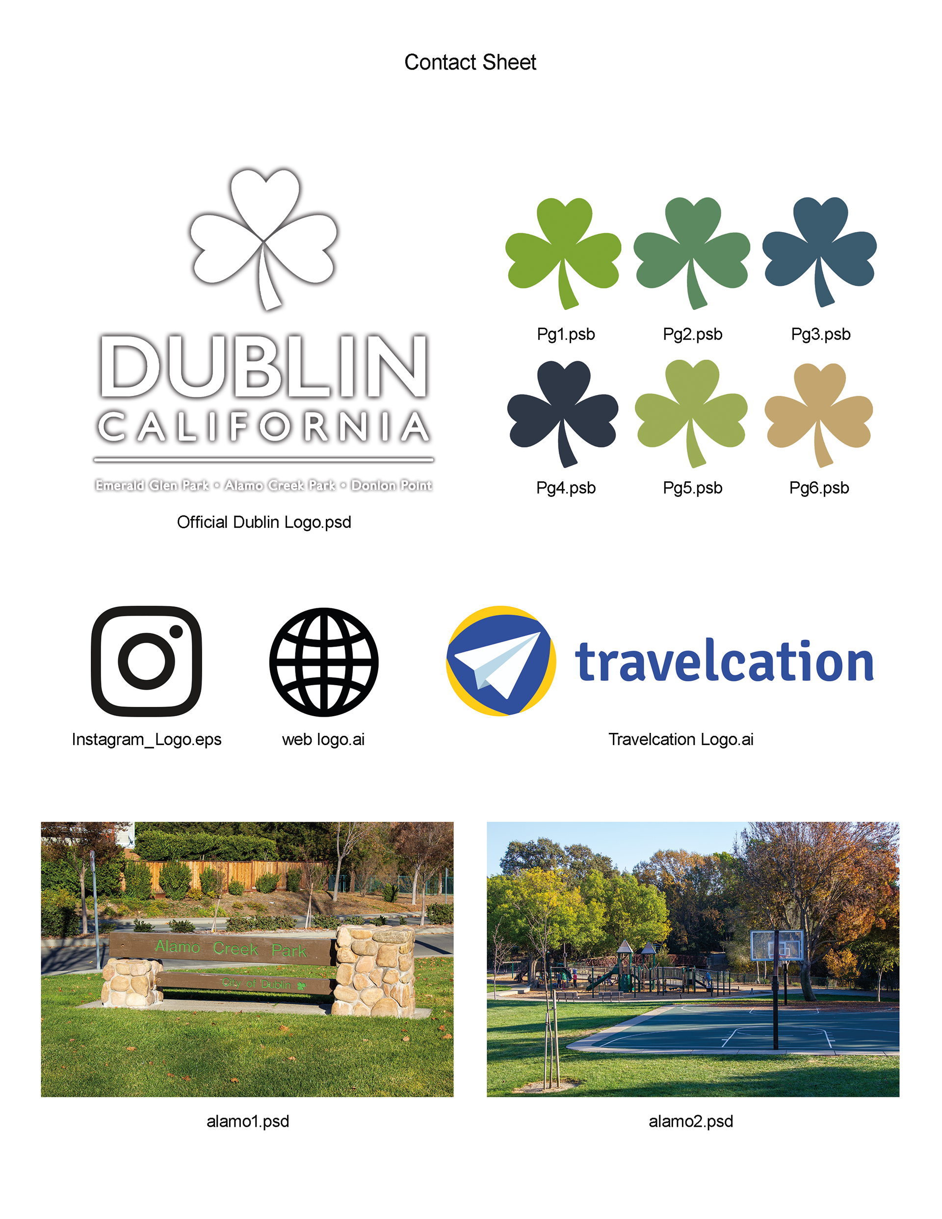
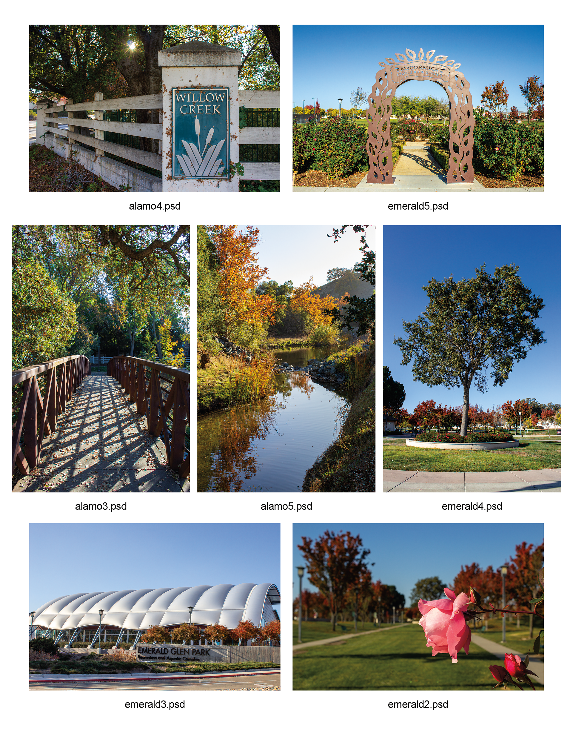
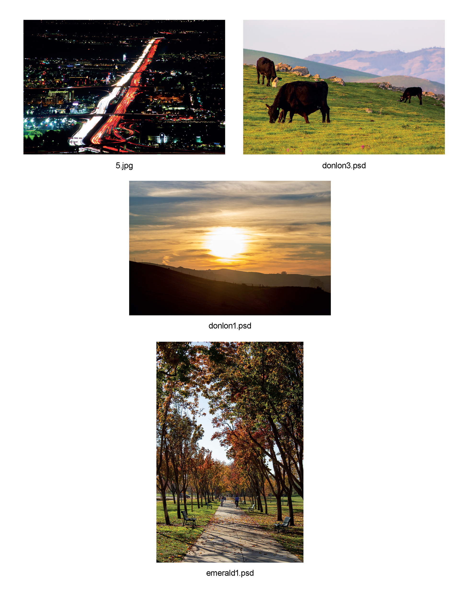
Here are the contact sheets for the final assets used on the booklet.